Purpose
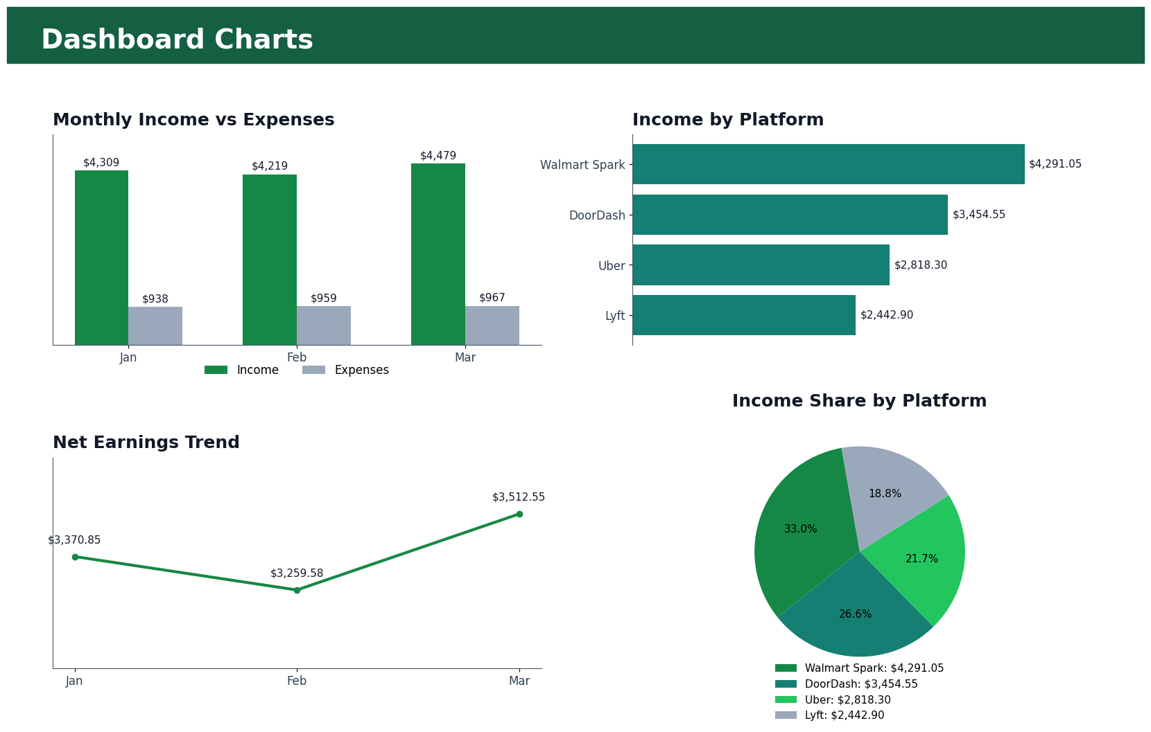
Create charts that show monthly income versus expenses, income by platform, net earnings trend, and platform income share using a pie chart.
Simple Example
The chart view helps quickly compare January, February, and March performance without reading every row in the workbook.
Simple Bookkeeping Decision Rule
Use charts only after the summary tables are complete. Charts should be based on clean summary data, not raw transactions when a summary already exists.
Analysis
The dashboard charts use the actual workbook totals. Monthly income moved from $4,308.75 in January to $4,479.15 in March, while monthly expenses stayed close to $950. Net earnings moved from $3,370.85 to $3,512.60. The income-by-platform chart and pie chart show Walmart Spark as the strongest platform with $4,291.05, followed by DoorDash at $3,454.55, Uber at $2,818.30, and Lyft at $2,442.90.
Result
The dashboard charts visually summarize the three-month bookkeeping data by showing monthly income versus expenses, income by platform, net earnings trends, and platform income distribution through a pie chart. The charts make the workbook easier for a client, manager, recruiter, or tax reviewer to understand quickly.